Reason to trust

How Our News is Made
Strict editorial policy that focuses on accuracy, relevance, and impartiality
Ad discliamer
Morbi pretium leo et nisl aliquam mollis. Quisque arcu lorem, ultricies quis pellentesque nec, ullamcorper eu odio.
By now we are all familiar with the price chart bitcoin pessimists throw at us when discussing the imminent “death” of bitcoin and the digital currency space as a whole. The classic bubble spike to above $1000 and the collapse to where we now sit just ahead of $200 does, indeed, lend credence to the suggestion that bitcoin has yet further to fall in value.
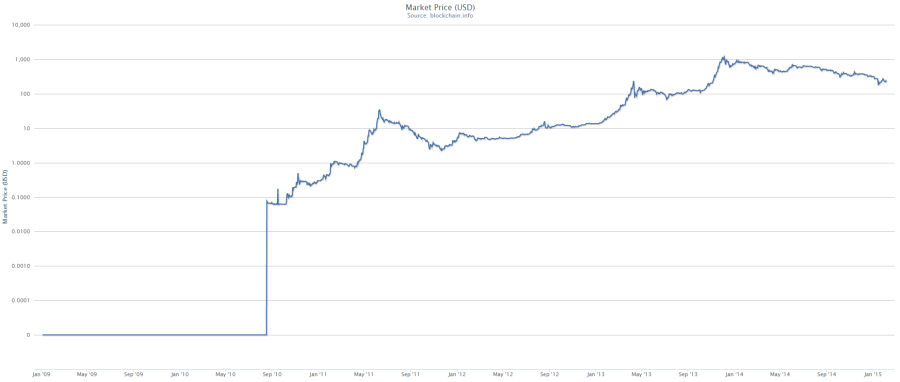
However, there is a much more logical way to chart changing values over time when looking at something like digital currency – a logarithmic chart. From a logarithmic chart, somebody looking at bitcoin price versus the US dollar can gain an added perspective. So, this said, what does the price of bitcoin versus the US dollar look like when charted logarithmically since its inception? Take a look below.
When considered logarithmically, it is clear that – despite the recent decline in price – bitcoin is still very much advancing in value (long-term) versus the fiat reserve. Sure, we may have seen a number of spikes followed by the inevitable deflation, but this shouldn’t be taken as an indication that bitcoin is doomed.
A popular doctor of economics refers to the traditional line chart that illustrates large, quick and rapidly expanding changes in something as “panic charts.” A look at US national debt on a linear chart for example, is enough to induce panic. A look at it on a logarithmic scale will show a pretty much constant rate of change.
While, of course, these are just charts of historical action and – especially in the early days of a breakout technology such as digital currency – cannot be relied upon as 100% accurately indicative of future events, a look at bitcoin from this perspective does at least stand up as an argument for bitcoin’s future, rather than against. Something that we believe is sorely needed at the moment.
Image Courtesy of Blockchain.info


Yeah the common bitcoiner tactic. Refer to log charts unless the price is rising.
You’re welcome to use a linear chart, however it may be a bit difficult for you to see previous data in the midst of an 8 Million Percent Rise in 5 years *rolling eyes*
If you are anti-bitcoin, what are you doing on this website exactly?. *** Be aware all, the BTC scene is RIFE with shills. The control groups behind the scenes, will do anything to sway opinion of BTC toward the negative. For obvious reasons. Not saying this is the exact case for this particular comment, but be Aware ***
Dead. Cat. Bounce. Forget the log chart, Sammy.
Think much?
The percentage change on the vertical axis over a given change in time on the horizontal axis, is what is important when evaluating values of most anything. This is precisely what a log chart shows, although the author doesn’t mention it.
Think about it!
Dead. Cat. Bounce. Forget the log chart, Bruce.
Reversion to the mean. Those bitbugs that believe in the ever-rising price of BTC, especially to heights above $1,000 again are childish–well-intentioned but ultimately childish. The hyper-parabolic money has already been made–thank you China.
Peer-to-peer payment technologies are efficient and the undeniable future of “money” and exchange; but, eventually, BTC will be usurped by a better cryptocurrency and/or DACs.
The upside? You can tell your kids all about the great Bitcoin tulpenwoede of November 2013.
Advice?
Buy low, sell high.
Eat your vegetables
lol bro, lol
I’m at InsideBitcoinNYC and didn’t see you at the Javits center? Anyway, the BTC market is manipulated just like the gold and (especially) the silver market. Who do you think made off with all the missing Mt. Gox BTC? Not Mark K that’s for sure. You can save all that log chart discussion for the 8th graders. I suggest you start truly thinking and not reacting like some uninformed suburban nobody, which is what you unfortunately appear as.
I’ll be flying to Hong Kong on Friday and enjoying two weeks there before InsideBitcoin Hong Kong begins. I’m sure I’ll see you there, right? Maybe you can scratch together a jet ticket (sell your mountain bike or skateboard) once you ask permission from your boss. Live much?
“However, there is a much more logical way to chart changing values over time when looking at something like digital currency” if you’re trying to ignore the massive collapse in value…
Not sure “logical” means what you think it does.