Reason to trust

How Our News is Made
Strict editorial policy that focuses on accuracy, relevance, and impartiality
Ad discliamer
Morbi pretium leo et nisl aliquam mollis. Quisque arcu lorem, ultricies quis pellentesque nec, ullamcorper eu odio.
Bitcoin just had its largest 48-hour pullback since May 2020, back when the asset’s halving took place. The drop in price has the cryptocurrency now trading below a key fundamental level. A deeper dive into other Bitcoin fundamentals may be hinting that a more severe correction that may have only just started.
Here’s what the cryptocurrency’s underlying network metrics are saying about what’s about to come in terms of price action across the crypto market.
Bitcoin Energy Value, Production Costs, and Hash Ribbons Potentially Signal Deep Downside
Technical analysis across any and all assets is exactly the same: open up a chart, check out the candle structure, and look for any patterns or signals. But when it comes to cryptocurrencies, fundamental analysis is dramatically different.
Fundamental analysis is based on two main concepts: qualitative analysis and quantitative analysis. Qualitative analysis comes down more to if you like a coin’s ticker, or if you prefer a Justin Sun against a Vitalik Buterin, for example.
In terms of quantitative analysis, rather than reviewing company revenue reports for tips on stock valuation changes, crypto analysts look at on-chain data and other barometers that measure the health of the underlying blockchain network.
In Bitcoin, this includes how much BTC is held in wallets or on exchanges, metrics like energy value and production costs, hash rate, difficulty, and network-to-transaction ratios.
These fundamentals unique to Bitcoin and crypto make things a bit more tricky, but thanks to contributions from the likes of Willy Woo and Charles Edwards, these metrics have been turned into TA tools.

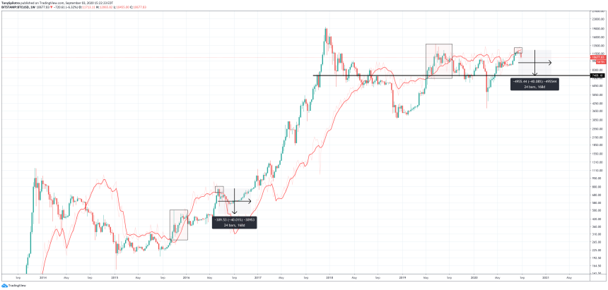
BTCUSD Daily Energy Value 2016 - 2020 Comparison | Source: TradingView
By adding these metrics to Bitcoin price charts, it can reveal some compelling signals. The chart above depicting Bitcoin’s energy value shows the first major weekly close below the indicator after quickly poking above it. The last time the cryptocurrency peeked its head above this level then abruptly fell below, was in June 2019, and it signaled a top.
Comparing the past bear market turned bull with whatever is currently going on in crypto, shows a similar initial pump from the bottom that got overheated too soon. The next time Bitcoin went slightly above this metric on weekly timeframes, the cryptocurrency had a 40% post-halving selloff.
This year’s halving came and went, but no death spiral ever arrived. However, energy value is just one signal that is suggesting it could still be coming.
Related Reading | Why Are Bitcoin Miners Moving An “Unusually” Large Amount of BTC?
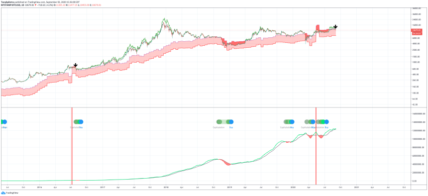
The cost of producing each BTC is now above the market price the cryptocurrency is trading at. When this happens, miners are better off buying – so instead, they sell.
The post-halving death spiral last time around was due to capitulating miners. Rising fees may have staved this off for some time, but miners have begun moving an “usually” large sum of BTC to exchanges.
The Hash Ribbons have started turning down once again, and when they do, it signals that such a capitulation event is taking place. Past instances of this, line up with the recent Black Thursday bottom, and the 2018 bear market bottom. It also matches the last post-halving death spiral, and it looks a lot like what’s about to happen next.

BTCUSD Daily Production Cost & Hash Ribbons 2016 - 2020 Comparison | Source: TradingView
NVT Ratio Demonstrates How Far A Drop In The Cryptocurrency Could Go
Finally, the last fundamental signal in Bitcoin that things aren’t looking so hot in the short-term, is the NVT ratio. NVT stands for network-to-transactions. This ratio compares Bitcoin’s price in relation to the total value being transacted across its network.
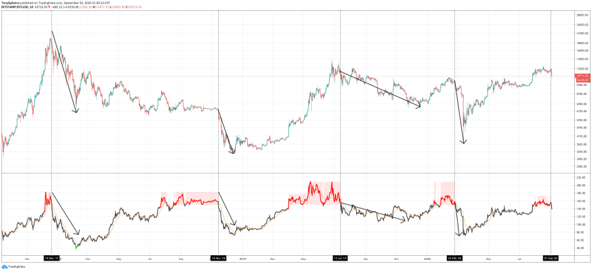
NVT recently got hot, similarly to the February 2020 peak, the June 2019 top, right before the drop to Bitcoin’s bottom, and before that when the asset hit $20,000. Now, it is back, and it’s no longer red.

BTCUSD Daily NVT Ratio Past Top Comparisons | Source: TradingView
When prices drop and NVT ratio turns back to black, some type of drop has followed. The furthest back was a 70% collapse from $20,000 to $5800 in February 2018. Bitcoin is currently showing a correlation to that particular bottom when compared to the DXY Dollar Currency Index.
The next time this tool triggered, Bitcoin fell over 50% to $3,200 and met what is hopefully the bottom. Next, was in June 2019, and although it took until December to get there, Bitcoin once again bottomed after a 53% drop.
2020 kickstarted a fast recovery to $10,000, but even quicker the cryptocurrency plummeted 62% to $3,800 on Black Thursday. Now, Bitcoin went back above $12,400 where it may have topped again according to the NVT ratio. But the question is – how deep does this drop go?
Related Reading | This Monthly MACD Bearish Divergence Warns Of Imminent Bitcoin Crash
Taking the four catastrophic collapses, and averaging them out comes to a 58% fall. A dump of that magnitude would take the cryptocurrency back to roughly $5,200. However, given the pandemic, the risk of the coming election, and the aforementioned ominous comparison to the DXY index, there is one more important thing to pay attention to.
According to the NVT ratio, Bitcoin tops out when the indicator turns red. It bottoms when it turns green. The only time the cryptocurrency has turned green since the $20,000 peak was when the crypto asset plunged from $20,000 to $5,800.
Could the latest sighting of red, give us the first glimpse of green before things move up again? And it could it all be due to the comeback of the greenback?


